Chapters
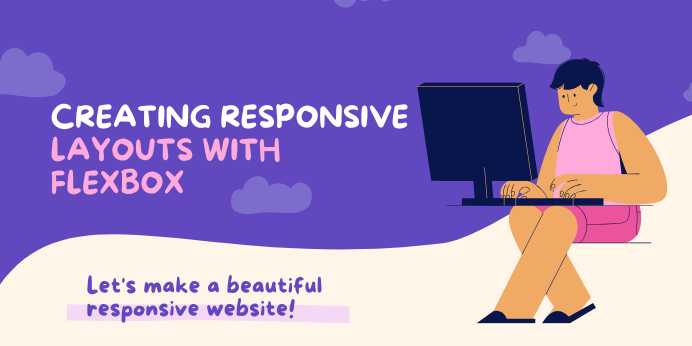
Creating Responsive Layouts with Flexbox: A Beginner’s Guide to Flexible Web Design
Overview
📱 Mastering Responsive
Layouts with Flexbox
In today’s digital world, users browse the web using a wide
range of devices—from widescreen monitors to smartphones held in one hand.
Designing a website that looks good everywhere isn’t just a
nice-to-have; it’s a requirement.
This is where Flexbox comes in.
Flexbox (Flexible Box Layout) is a CSS3 layout module
that makes it easier to design responsive, flexible, and predictable
layouts for various screen sizes and devices without the quirks and
frustrations of float-based designs or complex positioning hacks.
In this guide, you’ll dive deep into Flexbox and learn how
to use it to:
- Create
fluid layouts that adjust to screen size
- Center
content vertically and horizontally (finally, with ease!)
- Control
spacing and alignment without media queries
- Build
modern web layouts like navbars, cards, galleries, and forms
- Avoid
common pitfalls in CSS layout design
🧠 Why Flexbox?
Before Flexbox, developers relied on floats, tables,
and absolute positioning to control layout—approaches that were often
brittle and inconsistent.
Flexbox, on the other hand:
- Adapts
to different screen sizes automatically
- Aligns
items with minimal code
- Makes
UI components like grids, toolbars, or sidebars easy to build
- Supports
reordering of content without changing the HTML structure
With just a few properties, you can completely transform how
your elements behave in a container.
💡 When Should You Use
Flexbox?
Flexbox is ideal for:
- One-dimensional
layouts (rows or columns)
- Components
with variable height/width
- Alignment
of items inside containers
- Equal-spacing,
centering, wrapping, and order control
- Responsive
elements in navbars, sidebars, and dashboards
For complex two-dimensional layouts (rows and
columns), consider using CSS Grid. But for most responsive UIs, Flexbox
is your best friend.
🔍 Core Concepts You’ll
Learn
This guide walks you through the following Flexbox
fundamentals:
|
Concept |
Description |
|
Flex Container |
Parent element that
enables Flexbox |
|
Flex Items |
Children of
the container |
|
Main Axis / Cross
Axis |
The two axes Flexbox
uses to arrange items |
|
Justify Content |
Controls
horizontal alignment |
|
Align Items / Align
Content |
Controls vertical
alignment |
|
Flex Wrap |
Allows items
to wrap into multiple lines |
|
Flex Grow / Shrink
/ Basis |
Defines how items
grow, shrink, or maintain size |
You’ll also get hands-on with real examples to build:
- A
responsive header navigation bar
- A
multi-card layout for blog or product listings
- A
centered login or sign-up form
- Adaptive
pricing tables or testimonial sections
🛠️ Tools You’ll Need
To follow along, you’ll need:
- Basic
knowledge of HTML and CSS
- A
code editor (like VS Code, Sublime Text, etc.)
- A
modern browser (Chrome, Firefox, Edge, etc.) with DevTools
- Optionally,
CodePen or JSFiddle to test snippets in real-time
No frameworks. No JavaScript. Just pure CSS mastery.
📐 The Flexbox Advantage
for Responsive Design
When combined with media queries or relative units
like %, em, or fr, Flexbox becomes a powerful tool for mobile-first
development. You’ll be able to:
- Stack
items on mobile, align them on desktop
- Change
order without writing JS
- Automatically
fit elements into the available space
- Minimize
layout shifts and design inconsistencies
💪 What You’ll Be Able to
Do By the End
After finishing this guide, you'll confidently be able to:
- Build
responsive layouts without using a CSS framework
- Create
flexible navigation menus and UI components
- Implement
real-world responsive patterns like hero sections, card grids, and content
footers
- Debug
layout issues using browser DevTools
- Use
Flexbox to improve accessibility and maintainability of your web projects
🧩 Why Learn Flexbox Now?
CSS evolves fast, but Flexbox has already become a cornerstone
of modern CSS design. Knowing Flexbox not only boosts your technical
skills—it also prepares you for frameworks like Tailwind CSS, Bootstrap,
or React components, which all heavily use Flexbox under the hood.
If you’re planning a career in web development or want to
improve your design workflow, Flexbox is non-negotiable.
✅ Let’s Get Started
Ready to eliminate layout frustrations and build beautiful,
functional, and responsive websites?
In the next chapters, we’ll:
- Learn
how to set up a flex container
- Control
spacing, alignment, and direction
- Use
wrapping and ordering for responsiveness
- Build
real-world layout components
- Explore
tips, tricks, and best practices
- Finish
with a complete mini project (responsive layout using only Flexbox)
Let’s flex those layout muscles! 💪
FAQs
1. What is Flexbox in CSS?
A: Flexbox (Flexible Box Layout) is a CSS layout
model designed to distribute space and align items in a container—even when
their size is unknown or dynamic. It's perfect for creating responsive,
one-dimensional layouts (row or column).
2. How is Flexbox different from CSS Grid?
A: Flexbox is ideal for one-dimensional layouts
(either horizontal OR vertical), while CSS Grid handles two-dimensional
layouts (both rows AND columns). Flexbox is great for components; Grid is
better for full-page layouts.
3. Do I still need media queries with Flexbox?
A: Not always! Flexbox naturally adapts content for
different screen sizes. But combining Flexbox with media queries gives you
finer control for breakpoints, especially in complex responsive designs.
4. What does display: flex do?
A: It turns a container into a Flex Container,
activating Flexbox for all its direct children (Flex Items). Once
enabled, you can use properties like justify-content, align-items, and
flex-wrap.
5. Can Flexbox be used for centering elements?
A: Absolutely! One of Flexbox’s most popular features is its ability to center elements both vertically and horizontally using just two properties:
display: flex;
justify-content:
center;
align-items:
center;
6. What’s the difference between justify-content and align-items?
- justify-content
aligns items along the main axis (horizontal by default)
- align-items
aligns items along the cross axis (vertical by default)
7. How do I make items wrap in Flexbox?
A: Use the flex-wrap property:
flex-wrap: wrap;
This allows Flex Items to move onto multiple lines if they
don’t fit in one row.
8. What is the flex shorthand property?
A: flex is shorthand for:
flex:
[flex-grow] [flex-shrink] [flex-basis];
For example
flex: 1 1 200px;
Means: grow if needed, shrink if needed, and start at 200px
width.
9. Can I reorder items with Flexbox?
A: Yes! The order property lets you rearrange
elements without changing your HTML structure. Lower numbers appear first.
10. Is Flexbox supported in all browsers?
A: Yes. Flexbox is widely supported in all modern
browsers, including Chrome, Firefox, Edge, Safari, and even IE11 (with minor
limitations). It’s safe to use in production.
Tutorials are for educational purposes only, with no guarantees of comprehensiveness or error-free content; TuteeHUB disclaims liability for outcomes from reliance on the materials, recommending verification with official sources for critical applications.


Please allow ads on our site
Kindly log in to use this feature. We’ll take you to the login page automatically.
Login

Comments(0)