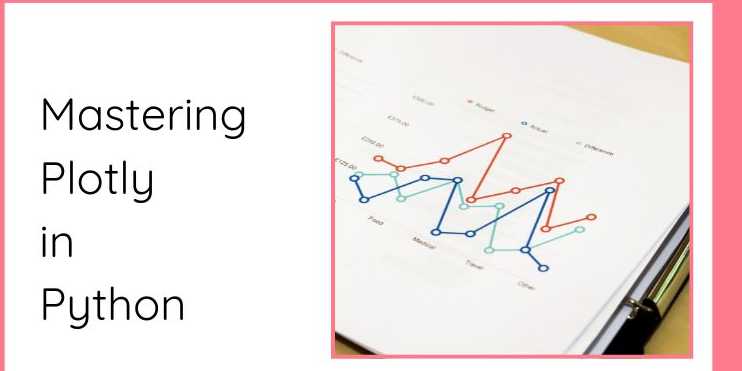
Mastering Plotly in Python: Interactive Data Visualization Made Easy

Overview
✅ Introduction (500-600 words):
In the realm of data visualization, the ability to represent
data clearly and effectively is paramount. As data-driven decision-making has
become an essential part of modern industries, the need for advanced data
visualization tools has grown substantially. One such tool that has gained
significant traction among data scientists, analysts, and developers is Plotly.
Unlike traditional plotting libraries, Plotly provides an interactive approach
to visualizing data, allowing users to engage with their visualizations in ways
that static charts cannot. From zooming into a specific data point to hovering
over values for more detailed insights, Plotly offers a range of interactive
features that enhance user engagement.
Whether you're creating plots for data analysis, machine
learning projects, or data-driven web applications, Plotly empowers
users to create visually appealing, informative, and interactive charts that
elevate the quality of data storytelling. By understanding the features,
capabilities, and use cases of Plotly, you will not only be able to represent
data clearly but also convey insights more effectively. This chapter will delve
into the basics of Plotly, its key features, installation, and a simple example
to get you started on your data visualization journey.
What is Plotly?
At its core, Plotly is an open-source graphing
library designed for creating interactive and rich visualizations in Python.
Plotly stands apart from many other visualization libraries because it
emphasizes interactivity, which is an essential aspect of modern data
visualization. With Plotly, you can create visualizations that users can zoom,
pan, and hover over to get more details, which significantly
improves user engagement. These interactive features make it possible to
explore datasets more dynamically and thoroughly, thus providing a deeper
understanding of the data.
Plotly supports a wide range of chart types such as line
charts, scatter plots, bar charts, histograms, heatmaps,
and even 3D surface plots. Whether you're dealing with simple data
exploration or complex data analysis, Plotly allows you to choose the right
plot type for your specific needs. You can even go beyond the basic 2D charts
and create 3D visualizations and interactive dashboards, making
it a powerful tool for both personal and professional data projects.
Behind the scenes, Plotly is built on top of D3.js, a
JavaScript library that is renowned for producing interactive and dynamic
visualizations on web browsers. Plotly takes the power of D3.js and provides a
Python-friendly interface, simplifying the creation of interactive
visualizations while preserving the flexibility that D3.js offers. The
integration with Python also makes it incredibly easy to work with data stored
in Pandas DataFrames or NumPy arrays, two of the most common
structures used in Python for data analysis.
Key Features of Plotly
Plotly stands out for its extensive functionality and
flexibility, which make it suitable for a wide variety of applications. Some of
the key features of Plotly are outlined below:
1. Interactive Visualizations
One of the standout features of Plotly is the ability to
create interactive plots. Traditional plotting libraries like Matplotlib
generate static images, but with Plotly, users can interact with the plots in a
dynamic way. Key interactive features include:
- Zooming:
Users can zoom into a specific range of data to focus on particular areas
of interest.
- Panning:
Allows users to move around the plot to view different sections.
- Hovering:
Hovering over data points reveals additional information, such as the
exact values at that point.
- Exporting:
Interactive visualizations can be exported as static images (PNG, JPEG),
interactive HTML files, or embedded in web applications.
These interactive capabilities provide a more engaging and
intuitive way to explore data, which is particularly useful when dealing with
large datasets or when presenting the data to non-technical stakeholders.
2. Flexibility
Plotly’s flexibility allows it to cater to a wide range of
data visualization needs. Whether you’re working with simple line charts or
more complex visualizations like 3D surface plots, Plotly can handle it
all. You can use it to:
- Plot
time series data using line charts.
- Create
bar charts for categorical data.
- Display
the distribution of data using histograms or box plots.
- Visualize
geographical data on maps using choropleth maps.
- Explore
relationships between variables with scatter plots.
- Represent
multivariable datasets with 3D surface plots or bubble charts.
This versatility makes Plotly a great tool for different
domains, from basic data exploration to complex machine learning and scientific
visualization.
3. Dash Integration
One of the most powerful aspects of Plotly is its seamless
integration with Dash, a framework developed by Plotly itself. Dash
allows users to build data-driven web applications with complex
visualizations and interactivity. By combining Plotly’s advanced plotting
features with Dash’s web application framework, you can create interactive
dashboards that display real-time data and provide interactive controls for
users.
With Dash, you can build apps that:
- Have
interactive filters, sliders, and drop-down menus.
- Display
real-time data updates.
- Allow
users to interact with plots (e.g., changing parameters and viewing
updated visualizations).
- Create
multi-page layouts with visualizations and text annotations.
Dash applications are ideal for building professional
data-driven applications that allow others to explore data interactively.
4. Cross-Platform and Export Capabilities
Plotly allows you to export your interactive visualizations
to multiple formats. You can save plots as static images (PNG, JPEG) for
presentations or export them as interactive HTML files that can be embedded in
web pages. Additionally, Plotly supports the integration of plots in Jupyter
Notebooks, which is popular among data scientists and researchers who need
to document and present their work interactively.
Moreover, Plotly visualizations can be embedded in web
applications, allowing you to create interactive dashboards and data-driven
websites.
5. Customizability
Plotly provides full control over the aesthetic aspects of
your plots, ensuring that your visualizations match the style and design of
your project. Some of the customization options include:
- Colors:
Plotly allows you to adjust the color scheme of your plots, and it offers
built-in color palettes, as well as the option to define custom colors.
- Themes:
You can apply predefined themes to your plots, or customize your own,
giving you the ability to create plots that fit your project’s overall
visual style.
- Axis
Labels: You can customize axis labels, titles, and legends to make
your visualizations more descriptive.
- Annotations:
You can add annotations to the plots to highlight important data points or
trends.
- Layouts:
The layout of the plot, such as the placement of the title, axis labels,
and legends, can be easily customized.
This level of customization allows you to create highly
polished and professional visualizations.
Installation
To get started with Plotly, you need to install the library
in your Python environment. The installation is straightforward and can be done
using pip, Python’s package manager. Open a terminal or command prompt
and run the following command:
pip
install plotly
After the installation is complete, you can import Plotly
into your Python script or Jupyter Notebook using the following import
statement:
import
plotly.express as px
Here, plotly.express is a high-level interface for creating
interactive plots with a simple and concise syntax. Plotly also supports
integration with Dash, Jupyter Notebooks, and Web Applications,
making it a versatile tool for data-driven projects.
Example: Simple Plotly Line Chart
To see how Plotly works in action, let’s start with a simple
example—a line chart of sales data over several months.
import
plotly.express as px
#
Sample data
data
= {'Month': ['Jan', 'Feb', 'Mar', 'Apr', 'May'],
'Sales': [100, 120, 150, 170, 200]}
#
Create the plot
fig
= px.line(data, x='Month', y='Sales', title='Monthly Sales Trend')
#
Show the plot
fig.show()
In this example:
- px.line()
is used to create a line chart with Month on the x-axis and Sales
on the y-axis.
- The fig.show()
method displays the plot in a web-based interactive format, allowing you
to zoom, pan, and hover over the data points for more information.
Plotly makes it easy to create interactive visualizations
with just a few lines of code, and the result is a highly engaging plot that
allows for deeper exploration of the data.
Why Plotly?
Plotly has emerged as one of the most popular libraries for
creating interactive and web-based visualizations due to its simplicity,
interactivity, and flexibility. While other libraries, such as Matplotlib,
excel at creating static visualizations, Plotly goes a step further by
providing interactive elements that enhance user engagement and exploration. By
mastering Plotly, you can significantly improve your data storytelling skills,
making it easier to communicate complex insights and findings in a way that’s
intuitive and accessible.
Whether you are exploring data during the initial analysis
phase, presenting findings to stakeholders, or building a data-driven
application, Plotly’s interactive capabilities will take your visualizations to
the next level.
FAQs
1. What is Plotly in Python?
Plotly is a powerful library for creating interactive, web-based data visualizations. It supports a wide range of chart types, including line charts, scatter plots, bar charts, and 3D charts.
2. How do I install Plotly in Python?
You can install Plotly via pip: pip install plotly.
3. What types of charts can I create with Plotly?
You can create a variety of interactive plots such as scatter plots, line charts, bar charts, pie charts, heatmaps, 3D plots, and more.
4. How do I create a basic line chart with Plotly?
Use plotly.express.line() to create a line chart. You can pass in your data and specify the x and y axes.
5. Can I customize the appearance of my plots in Plotly?
Yes! Plotly provides a wide range of customization options such as color schemes, titles, legends, axis labels, and much more.
6. How can I make my Plotly charts interactive?
Plotly charts are interactive by default. You can zoom, pan, and hover over data points to view additional information.
7. Can I save Plotly plots as images?
Yes, you can save Plotly plots as static images in formats like PNG, JPEG, or SVG using the write_image() function.
8. What is Dash, and how does it relate to Plotly?
Dash is a Python framework for building web applications that can display interactive Plotly charts. It allows you to create data dashboards with Plotly visualizations.
9. How do I create 3D plots in Plotly?
Plotly supports creating 3D plots like scatter plots and surface plots using the plotly.graph_objects module.
10. Can I use Plotly with Jupyter Notebooks?
Yes! Plotly integrates seamlessly with Jupyter Notebooks. You can display interactive plots directly in the notebook using fig.show().
Tutorials are for educational purposes only, with no guarantees of comprehensiveness or error-free content; TuteeHUB disclaims liability for outcomes from reliance on the materials, recommending verification with official sources for critical applications.


Please allow ads on our site
Kindly log in to use this feature. We’ll take you to the login page automatically.
Login

Comments(1)