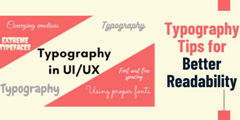
Typography Tips for Better Readability: How to Design with Type That Users Love to Read

Overview
Why Typography is the Unsung Hero of Good UX
Typography is far more than a decorative element—it’s the foundation
of clear communication in any digital interface. Whether you’re designing a
blog, an app interface, or a complex dashboard, your typographic choices
shape the user’s reading experience, guide their attention, and influence their
behavior.
You may not always notice typography when it’s done right,
but poor typography stands out like a sore thumb—causing eye strain, confusion,
and frustration. It doesn't matter how great your content is; if users can’t
comfortably read it, they'll leave. That’s why learning effective typography
tips for better readability is essential for every designer, developer, or
content creator.
In this guide, we’ll dive into the most practical and
impactful typography strategies to improve readability, increase engagement,
and ensure that users enjoy interacting with your content.
The Role of Typography in UX and Readability
Typography is the art and science of arranging type. In UX,
it's not just about choosing a font—it’s about structuring information
in a way that supports effortless reading, comprehension, and navigation.
Great typography accomplishes the following:
- Enhances
legibility and comprehension
- Provides
visual hierarchy and structure
- Reflects
brand personality
- Guides
the reader’s eye across the page
- Reduces
cognitive load and fatigue
A well-structured typographic system brings clarity,
elegance, and usability to every touchpoint of your digital product.
Key Typography Components That Affect Readability
To design better with type, you need to understand the
building blocks that influence how users experience text.
1. Font Choice
Different fonts communicate different tones and levels of
professionalism. Choosing the right font ensures that your content resonates
with your target audience.
- Serif
Fonts (e.g., Times New Roman, Georgia): Traditional and formal
- Sans-serif
Fonts (e.g., Arial, Helvetica, Open Sans): Clean and modern
- Monospace
Fonts (e.g., Courier): Technical or code-based applications
- Display
Fonts (e.g., Lobster, Pacifico): For headlines and decorative use only
Avoid overly ornate or stylized fonts in body text—legibility
should always come first.
2. Font Size
Readable font sizes differ by device type and user base. As
a general rule:
- Body
text on desktop: 16–18px
- Body
text on mobile: 14–16px
- Headings:
Should be clearly larger than the body, often 24px–36px or more
Consider your audience; older users may benefit from larger
base font sizes.
3. Line Height (Leading)
Line height influences how easily users can scan and read
text. Too tight, and it feels cramped; too loose, and the flow breaks.
- Recommended
line height: 1.4–1.6 times the font size
This provides enough breathing space for the eyes to travel
from one line to the next without fatigue.
4. Line Length
Ideal line length makes reading comfortable and fast. If
lines are too short, readers experience unnecessary line breaks; if too long,
their eyes get tired tracking the line back.
- Ideal
range: 45–75 characters per line
This guideline promotes optimal reading speed and
comprehension.
5. Letter Spacing (Tracking)
Letter spacing adjusts the space between characters across a
block of text. For body text, use neutral or slightly increased spacing.
For all-caps headings, a slight increase (1–2px) can improve clarity.
6. Hierarchy and Structure
Use different font sizes, weights, and colors to create a clear
visual hierarchy:
- Headings
(H1–H6)
- Subheadings
- Body
text
- Captions
and metadata
Consistent hierarchy helps users scan content faster
and understand the layout intuitively.
Typography Best Practices for Better Readability
Here’s a bulletproof checklist for designing reader-friendly
content:
- Use
web-safe or Google Fonts with proven readability
- Choose
a maximum of 2–3 font families per project
- Prioritize
contrast: dark text on a light background or vice versa
- Avoid
text justification on the web (left-align is more natural)
- Never
use all caps in body content
- Be
consistent with font weights and sizes
- Ensure
responsive typography across breakpoints
- Use
bold for emphasis—not underline (which can be confused with links)
Accessible Typography: Designing for Everyone
Typography must serve all users, including those with
visual impairments or reading disorders.
Accessibility Guidelines:
- Minimum
contrast ratio: 4.5:1 for normal text, 3:1 for large text
- Avoid
red-green combinations
- Allow
users to scale text without breaking layout
- Provide
adequate spacing between lines and paragraphs
- Avoid
using color as the only way to convey meaning
These practices help users with dyslexia, low vision, or
cognitive challenges navigate your content effectively.
Tools and Resources for Better Typography
|
Tool |
Use Case |
|
Google Fonts |
Free, web-optimized
font library |
|
Adobe Fonts |
Premium font
library for design work |
|
Type Scale by
Utopia |
Generates responsive
font scales |
|
WebAIM Contrast Checker |
Checks color
contrast accessibility |
|
Fontpair |
Helps find font
pairings that work well |
Typography in Action: Real Examples
- Medium.com
uses clean, readable fonts, optimal line length, and excellent hierarchy,
making long-form reading pleasurable.
- Apple
uses San Francisco font, a sans-serif type optimized for clarity across
their ecosystem, creating a uniform, accessible experience.
- BBC
News employs strong font sizes and bold headlines for information
hierarchy and quick scanning.
Final Thoughts
Typography isn’t just a design decision—it’s a usability
feature. When done well, it makes content more approachable, more
memorable, and more human.
By focusing on readability, accessibility, and consistency,
you empower your users to interact with your content comfortably and
confidently.
FAQs
1. What is the most readable font for websites?
Sans-serif fonts like Open Sans, Roboto, and Helvetica are widely considered highly readable for screen-based interfaces due to their clean and simple letterforms.
2. How big should the body text be for good readability?
The ideal body text size is typically 16px–18px for desktop and 14px–16px for mobile, depending on your audience and content density.
3. What line height should I use for web typography?
A line height of 1.4 to 1.6 times the font size provides optimal spacing for readability and prevents text from appearing cramped.
4. Why is line length important in typography?
Line length affects reading speed and comprehension. Ideal length is 45–75 characters per line; too long or short can cause user fatigue or scanning issues.
5. How many fonts should I use in a single design?
To maintain visual harmony and focus, use no more than two or three complementary fonts—typically one for headings and one for body content.
6. Is justified text good for readability?
No, left-aligned (ragged-right) text is generally more readable on the web. Justified text can create uneven spacing that disrupts reading flow.
7. What is responsive typography?
Responsive typography automatically adjusts font sizes, spacing, and layout for different screen sizes to maintain readability on all devices.
8. How does color contrast affect typography?
High contrast between text and background improves readability, especially for users with visual impairments. Low contrast can make reading difficult.
9. Should I avoid all caps in my designs?
Yes, all caps can reduce legibility and reading speed, especially in body text. It’s best reserved for short labels or acronyms.
10. What are some good tools for typography testing?
WebAIM Contrast Checker, Google Fonts, Type Scale, and Adobe Fonts are excellent tools for evaluating and optimizing typography choices.
Tutorials are for educational purposes only, with no guarantees of comprehensiveness or error-free content; TuteeHUB disclaims liability for outcomes from reliance on the materials, recommending verification with official sources for critical applications.


Please allow ads on our site
Kindly log in to use this feature. We’ll take you to the login page automatically.
Login

Comments(0)