Embark on a journey of knowledge! Take the quiz and earn valuable credits.
Take A QuizChallenge yourself and boost your learning! Start the quiz now to earn credits.
Take A QuizUnlock your potential! Begin the quiz, answer questions, and accumulate credits along the way.
Take A QuizChapters
Advanced Excel Charts Tutorial: How to Create Professional-Level Graphs and Charts

Overview
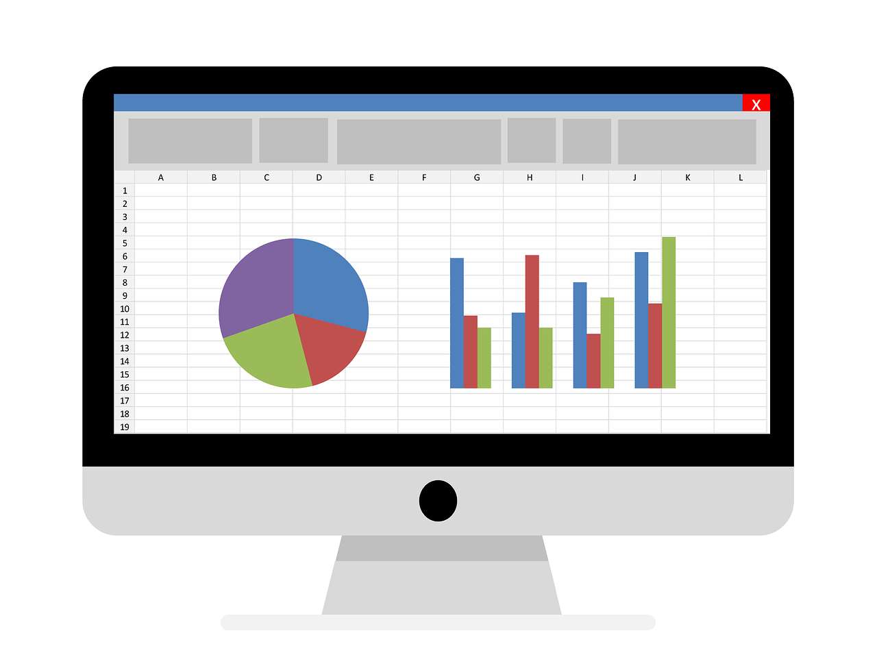
Learn how to create professional charts in Excel with our advanced Excel charts tutorial. We'll show you tips and tricks for creating impressive charts that will make your data visualization stand out. Our step-by-step guide will cover advanced chart types, formatting techniques, and data analysis tools. Whether you're a beginner or an experienced Excel user, this tutorial will help you take your charts to the next level. FAQs What are some advanced chart types I can create in Excel? You can create advanced chart types such as waterfall charts, Pareto charts, and Gantt charts in Excel. How can I customize the appearance of my charts? You can customize the appearance of your charts by using formatting techniques such as changing colors, fonts, and chart elements. What data analysis tools can I use to enhance my charts? You can use data analysis tools such as trendlines, regression analysis, and forecasting to enhance your charts and gain insights from your data. How can I create interactive charts in Excel? You can create interactive charts in Excel by using features such as chart animations, data labels, and tooltips.
Start TutorialPosted on 22 Sep 2024, this text provides information on Excel. Please note that while accuracy is prioritized, the data presented might not be entirely correct or up-to-date. This information is offered for general knowledge and informational purposes only, and should not be considered as a substitute for professional advice.
Similar Tutorials

Advanced Excel Charts Tutorial: How to Create Prof...
Learn how to create professional charts in Excel with our advanced Excel charts tutorial. We'll show...

Advanced Excel Functions: Tips and Tricks for Boos...
Are you tired of spending hours working on Excel spreadsheets, only to find yourself stuck on a prob...

Apache Flume Tutorial: An Introduction to Log Coll...
Apache Flume is a powerful tool for collecting, aggregating, and moving large amounts of log data fr...
Explore Other Libraries
Related Searches
Please allow ads on our site
Please log in to access this content. You will be redirected to the login page shortly.
Login
Join Our Community Today
Ready to take your education and career to the next level? Register today and join our growing community of learners and professionals.

Your experience on this site will be improved by allowing cookies. Read Cookie Policy
Your experience on this site will be improved by allowing cookies. Read Cookie Policy


Comments(1)