Understanding Descriptive vs Inferential Statistics: A Complete Guide for Beginners

Overview
In a world driven by data, the ability to understand and
interpret statistics is more valuable than ever. From healthcare and marketing
to sports and scientific research, statistics help us summarize trends, draw
insights, and make informed decisions.
But when diving into the world of statistics, many beginners
encounter a common question:
What’s the difference between descriptive and inferential
statistics, and when should I use each?
If you’ve ever found yourself overwhelmed by numbers,
charts, p-values, or confidence intervals, don’t worry — you’re not alone. This
guide is designed to help you clearly understand the two main branches
of statistics, how they work, and where they apply.
Let’s break it down:
🎯 What Are Descriptive
and Inferential Statistics?
In simple terms:
- Descriptive
statistics help us summarize and describe the features of a
dataset.
- Inferential
statistics help us draw conclusions about a population based on
a sample.
They both serve different purposes, but work together to
provide a complete picture of data analysis.
📊 What Are Descriptive
Statistics?
Descriptive statistics are the first step in data
analysis. They provide a snapshot of your data — helping you understand
what it looks like, how it’s distributed, and whether there are any obvious
trends or outliers.
✅ Key Techniques in Descriptive
Statistics:
- Measures
of Central Tendency:
- Mean
(average)
- Median
(middle value)
- Mode
(most frequent value)
- Measures
of Dispersion:
- Range
(max - min)
- Variance
- Standard
Deviation
- Interquartile
Range (IQR)
- Frequency
Distribution:
- How
often each value appears
- Visualization
Tools:
- Bar
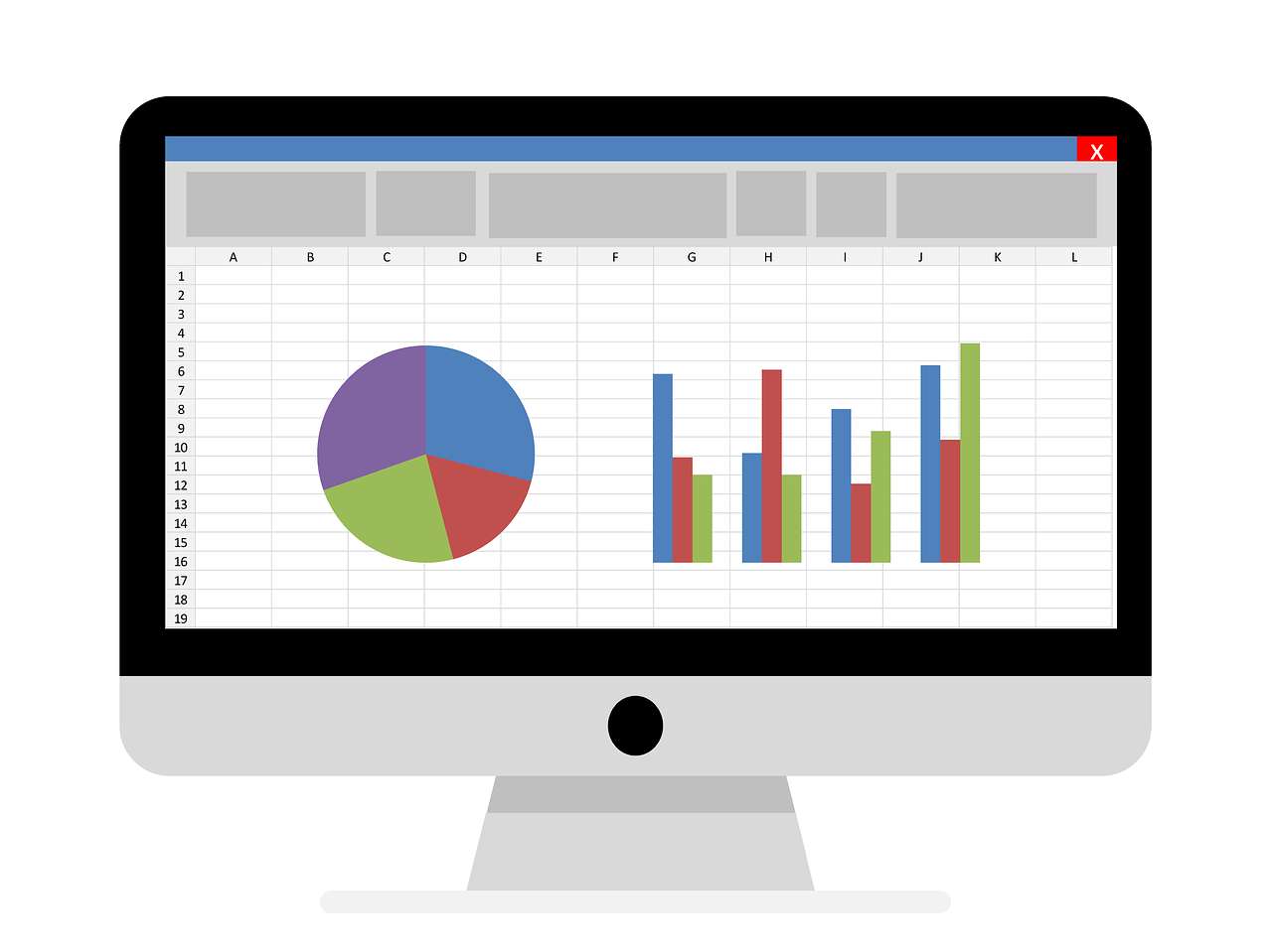
charts, histograms, pie charts, box plots
📌 Example:
If we collect the ages of 100 students and calculate the
average age to be 21, that’s descriptive. We’re simply summarizing the
data we have.
📈 What Are Inferential
Statistics?
Inferential statistics go one step further. Instead of just
describing the data we have, we use it to make predictions or
generalizations about a larger group.
Since it's often impossible (or impractical) to measure an
entire population, inferential statistics allow us to analyze a sample,
and infer things about the broader population.
✅ Key Techniques in Inferential
Statistics:
- Estimation:
- Point
estimates (e.g., sample mean)
- Confidence
intervals
- Hypothesis
Testing:
- Null
and alternative hypotheses
- p-values
- Type
I and Type II errors
- t-tests,
chi-square tests, ANOVA
- Correlation
& Regression Analysis:
- Understanding
relationships between variables
- Predicting
future outcomes
📌 Example:
If we survey 500 voters to estimate the outcome of a
national election, and calculate a 95% confidence interval that Candidate A
will receive 52–56% of votes — that’s inferential.
🔍 Descriptive vs.
Inferential Statistics: Key Differences
|
Feature |
Descriptive
Statistics |
Inferential
Statistics |
|
Purpose |
Describe and summarize
data |
Make predictions, test
hypotheses |
|
Data Scope |
Entire
dataset (sample or population) |
Sample used
to generalize about population |
|
Techniques |
Mean, median, mode,
SD, charts |
Confidence intervals,
hypothesis testing |
|
Output Type |
Concrete
values and visuals |
Probabilistic
conclusions |
|
Decision-Making |
Describes past or
current data |
Assists in forecasting
or future decisions |
💡 When to Use Which?
|
Scenario |
Use |
|
You want to explore
raw data and get a quick summary |
Descriptive |
|
You need to make a prediction based on a sample |
Inferential |
|
You're presenting
basic demographics to stakeholders |
Descriptive |
|
You're testing if a new marketing strategy improved sales |
Inferential |
In reality, both approaches often work together.
Descriptive stats prepare and guide us; inferential stats help us act.
📚 Real-Life Applications
🏥 Healthcare:
- Descriptive:
Average blood pressure of patients.
- Inferential:
Testing if a new drug lowers blood pressure across a population.
📈 Marketing:
- Descriptive:
Engagement rates across demographics.
- Inferential:
A/B testing email subject lines to see which version performs better.
📊 Education:
- Descriptive:
Mean GPA of a class.
- Inferential:
Estimating how GPA trends reflect national education performance.
🛠️ Tools You Can Use
- Excel
/ Google Sheets – Great for basic descriptive stats and visualization.
- Python
(Pandas, NumPy, SciPy, Statsmodels) – Suitable for both types of
stats.
- R
Language – A powerhouse for inferential testing and reporting.
- SPSS
/ SAS – Widely used in academic and business statistics.
🧠 Common Pitfalls to
Avoid
- Confusing
correlation with causation
Just because two things are correlated (e.g., ice cream sales and drowning deaths) doesn't mean one causes the other. - Assuming
sample = population
Always remember that your conclusions are subject to error — hence the use of confidence intervals and p-values. - Overinterpreting
p-values
A low p-value doesn’t “prove” anything — it only suggests evidence against the null hypothesis.
✅ Conclusion
Understanding the difference between descriptive and
inferential statistics is foundational to becoming a confident data analyst
or scientist. While descriptive statistics help you understand what your data is,
inferential statistics help you make decisions about what the data means
in a broader context.
If you're just starting out in data science, business
analytics, or research, mastering these two pillars is your first big step
toward turning raw numbers into valuable insights.
So next time you're handed a dataset or analyzing results,
ask yourself:
- Am I
just summarizing?
- Or
am I trying to generalize or test a hypothesis?
The answer will guide you toward using the right statistical
tools — and becoming a smarter, more responsible decision-maker.
FAQs
1. What is the main difference between descriptive and inferential statistics?
Answer: Descriptive statistics summarize and describe the features of a dataset (like averages and charts), while inferential statistics use a sample to draw conclusions or make predictions about a larger population.
2. Do I need both descriptive and inferential statistics in a data analysis project?
Answer: Yes, typically. Descriptive stats help explore and understand the data, and inferential stats help make decisions or predictions based on that data.
3. Can I use descriptive statistics on a population?
Answer: Absolutely. Descriptive statistics can be used on either a full population or a sample — they simply describe the data you have.
4. Why do we use inferential statistics instead of just analyzing the whole population?
Answer: It’s often impractical, costly, or impossible to collect data on an entire population. Inferential statistics allow us to make reasonable estimates or test hypotheses using smaller samples.
5. What are examples of descriptive statistics?
Answer: Common examples include the mean, median, mode, range, standard deviation, histograms, and pie charts — all of which describe the shape and spread of the data.
6. What are common inferential statistical methods?
Answer: These include confidence intervals, hypothesis testing (e.g., t-tests, chi-square tests), ANOVA, and regression analysis.
7. Is a confidence interval descriptive or inferential?
Answer: A confidence interval is an inferential statistic because it estimates a population parameter based on a sample.
8. Are p-values part of descriptive or inferential statistics?
Answer: P-values are part of inferential statistics. They are used in hypothesis testing to assess the evidence against a null hypothesis.
9. How do I know when to stop with descriptive statistics and move to inferential?
Answer: Once you've summarized your data and understand its structure, you'll move to inferential statistics if your goal is to generalize, compare groups, or test relationships beyond your dataset.
10. Can visualizations be used in inferential statistics?
Answer: Yes — while charts are often associated with descriptive stats, inferential techniques can also be visualized (e.g., confidence interval plots, regression lines, distribution curves from hypothesis tests).
Tutorials are for educational purposes only, with no guarantees of comprehensiveness or error-free content; TuteeHUB disclaims liability for outcomes from reliance on the materials, recommending verification with official sources for critical applications.
Similar Tutorials

Advanced Excel Charts Tutorial: How to Create Prof...
Learn how to create professional charts in Excel with our advanced Excel charts tutorial. We'll show...

Advanced Excel Functions: Tips and Tricks for Boos...
Are you tired of spending hours working on Excel spreadsheets, only to find yourself stuck on a prob...

Apache Flume Tutorial: An Introduction to Log Coll...
Apache Flume is a powerful tool for collecting, aggregating, and moving large amounts of log data fr...
Explore Other Libraries
Related Searches
Please allow ads on our site
Kindly log in to use this feature. We’ll take you to the login page automatically.
Login
Join Our Community Today
Ready to take your education and career to the next level? Register today and join our growing community of learners and professionals.

Your experience on this site will be improved by allowing cookies. Read Cookie Policy
Your experience on this site will be improved by allowing cookies. Read Cookie Policy


Comments(0)